Cascading Style Sheets is the best way to build the Website more attractive. CSS has lots of tricks. Different type of tricks using knowledge and good CSS design always holds the client to spend his/her precious time to the website. I was started to build the website as a PSD slicing, then I learned lots of HTML tags and new CSS tricks. In the same time, I made many attractive websites with the help of CSS2 and CSS3. So, that’s why I want to share a few CSS tricks with CSS hack rules which I think every web developer needs to know.
Top 10 CSS Hacks:
1. Any Section Shows in the Center of the Screen with Position Absolute CSS
[code]section { position: absolute; left: 50%; top: 50%; transform: translate(-50%, -50%); padding: 20px; background: #444; color: #fff;}[/code]
If we need any section display in the center of the screen for any resolution, then we can follow this trick. It’s very easy to implement on the website.
2. Vertical Height
[code]fullheight { height: 90vh; }[/code]
Sometimes we need 90% or 60% height for the entire screen. That time you can manage this with vh (view height) CSS trick as I mentioned below.
3. CSS Columns
When we create any column-based layouts then we usually use JavaScript, which is very complicated and takes time. But, now there is a way around this by using the CSS columns rule:
HTML
[code]<div class=”container”>
<p>Lorem ipsum dolor sit amet, consectetur adipiscing elit. Maecenas pellentesque urna nec eros ornare, ac tristique diam porta. Donec fermentum velit eget dignissim condimentum. Sed rutrum libero sit amet enim viverra tristique. Mauris ultricies ornare arcu non adipiscing. Sed id ipsum vitae libero facilisis pulvinar id nec lacus. Ut lobortis neque et luctus mattis. Morbi nunc diam, elementum rutrum tellus non, viverra mattis diam. Vestibulum sed arcu tincidunt, auctor ligula ut, feugiat nisi. Phasellus adipiscing eros ut iaculis sagittis. Sed posuere vehicula elit vel tincidunt. Duis feugiat feugiat libero bibendum consectetur. Ut in felis non nisl egestas lacinia. Fusce interdum vitae nunc eget elementum. Quisque dignissim luctus magna et elementum. Cum sociis natoque penatibus et magnis dis parturient montes, nascetur ridiculus mus. Sed nunc lorem, convallis consequat fermentum eget, aliquet sit amet libero.</p>[/code]
CSS
[code]container {width: 500px; margin: 0 auto;}
/* Creating columns CSS */
.container p { -moz-columns:3; -webkit-columns:3; columns:3;}[/code]
4. First letter caps
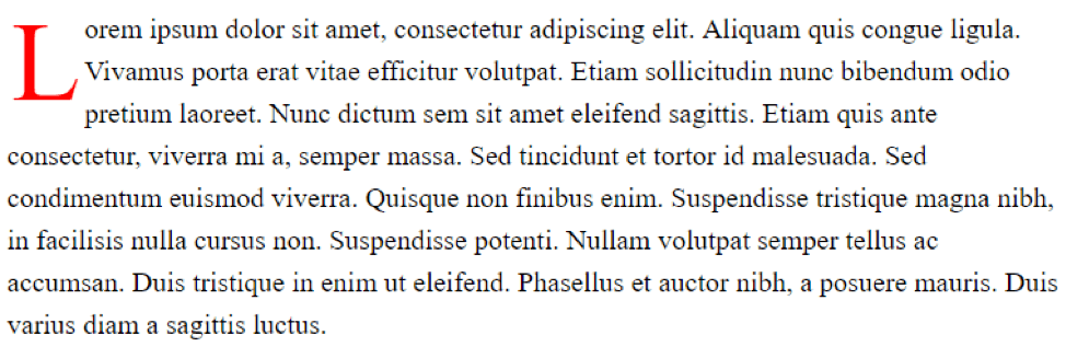
We know drop caps content grabs our attention first because it looks very nice. It feels like a traditional book-style and we all hope to put this style in the content block.
Now CSS gives us the opportunity. Please check the below example.
[code]p:first-letter{ display: block; float: left; margin:3px; color:#ff0000; font-size:80px;}[/code]
5. Gradient Text and Background
Gradient color looks very attractive. Previously we were used gradient image. But now CSS have new tricks for gradient CSS. Here is an example.
Text gradient
[code]h2 {
font-size: 50px;
background: -webkit-linear-gradient(#eee, #333);
-webkit-background-clip: text;
-webkit-text-fill-color: transparent;
}[/code]
Background Gradient
[code].section {
height: 200px;
background-color: red; /* For browsers that do not support gradients */
background-image: linear-gradient(red, yellow); /* Standard syntax (must be last) */[/code]
6. Cross-Browser Change the Text Selection Color
When we select any portion of text in the browser, then it shows stander color blue. But CSS has the trick to change this color in a different browser.
[code]::selection {
background-color: green; /* Safari */
}
::-moz-selection {
background-color: red; /* Firefox */
7. Browser CSS Hacks
Every browser has default spacing, gap, sizing etc. and when we create any pixel perfect design for all browser supported, then sometimes we need those ticks which are very useful for building a perfect website design. Also, sometimes we need a different type of style for a different browser, then we can follow this CSS hacking rules. It’s very helpful for any browser related issue.
[code]/* IE6 */
.textColor { _color: red }
/* IE6, IE7 */
.textColor { *color: red; }
/* Everything but IE6 */
.textColor { color/**/: red }
/* IE6, IE7, IE8, but also IE9 in some cases 🙁 */
.textColor { color: red\9; }
/* IE7, IE8 */
.textColor { color/*\**/: red\9; }
/* IE8, IE9 */
.textColor {color: red\0/;}
/* IE9, IE10 */
@media screen and (min-width:0\0) {
.textColor { color: red}
}[/code]
[code]/* Firefox CSS hacks */
@-moz-document url-prefix() {
.textColor { color: red; }
}
/* Chrome CSS hacks */
@media screen and (-webkit-min-device-pixel-ratio:0) {
.textColor { color:red; }
}
/* Opera CSS hacks */
@media all and (-webkit-min-device-pixel-ratio:10000), not all and (-webkit-min-device-pixel-ratio:0) {
head~body .textColor { color:red; }
}
/* Safari CSS hacks */
@media screen and (-webkit-min-device-pixel-ratio:0) {
.textColor { color: red; }
}
/* Opera 9.27 and below, safari 2 */
html:first-child .textColor { color: red }
/* Safari 2-3 */
html[xmlns*=””] body:last-child .textColor { color: red }
/* safari 3+, chrome 1+, opera9+, ff 3.5+ */
body:nth-of-type(1) .textColor { color: red }
/* safari 3+, chrome 1+, opera9+, ff 3.5+ */
body:first-of-type .textColor { color: red }
/* saf3+, chrome1+ */
@media screen and (-webkit-min-device-pixel-ratio:0) {
.textColor { color: red }
}
/* iPhone / mobile webkit */
@media screen and (max-device-width: 480px) {
.textColor { color: red }
}[/code]
8. Mobile Browser Input Field Design Issue in iPhone
When you open any website in iPhone browser then you can follow every input adding rounded corners and drop shadows effects. Sometimes we don’t need this style. Well, it’s a very simple fix. Just add this to any input fields or buttons you don’t want to restyle.
[code]textarea,
input.text,
input[type=”text”],
input[type=”button”],
input[type=”submit”],
.input-checkbox {
-webkit-appearance: none;
border-radius: 0;
}[/code]
9. Important
Sometimes we follow few inline CSS written in the HTML file and We can’t hack those style properties with the external CSS file, because inline CSS override your external CSS. But don’t worry, CSS gives us the opportunity to override this.
[code]<p class=’’textColor” style=”color: red;”>Example</p>
.textColor {color: green !important;}[/code]
10. Responsive
In present day every client’s needs responsive design because they want all device compatible website and now it’s possible from media query. Here is the example below.
[code]@media only screen and (max-width: 768px) {
.textColor {
color: white;
}
}[/code]
Now, you can easily connect your line of business applications to automate the business process!
You may also like:
Ecommerce 10 Years Challenge – Witnessing Technological Disruptions
13 Tips For Writing Amazing Ecommerce Product Descriptions To Drive Sales
Custom Theme Vs Pre-Built Theme: Developing Ecommerce Website


