Changing trends towards Flat design had overshadowed the ruling world of naturalism. 2014 has brought a complete shift towards the sophisticated & dynamic look of flat pattern.
Simplicity always catches the eye, whether you are viewing a website in a mobile, tablet or desktop. Flat design has its own beauty and more and more eCommerce businesses are incorporating flat design in their websites. Essence of flat design are:
Smart use of colors:
Knowledge of Color Wheel or Color Contrast is really important, whether it is complimentary color or monochromatic color schemes.
Typography:
Typography is the ultimate thing which brings a perfect change of look in any design.
Attractive images:
In spite of using completely flat colors, sometimes use of catchy images gives a complete change in the look of the site.
So here he have listed 10 ecommerce sites which have incorporated flat design and portray a perfect blend of the above features.
-
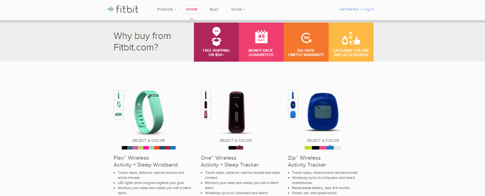
- FitbitFitbit gadgets track everyday health and fitness. The website is so dynamically presented in their intro page which relates your activity with animal kingdom’s ‘almost’ true facts. Brilliant use of colors and animated characters makes it fun to scroll down.

-
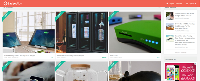
- Gadget FlowThis is a curated hub having the best tech gadgets from around the internet giving direct links to product pages on third-party ecommerce sites. Full width flat UI with bold use of colors and cool images.
-
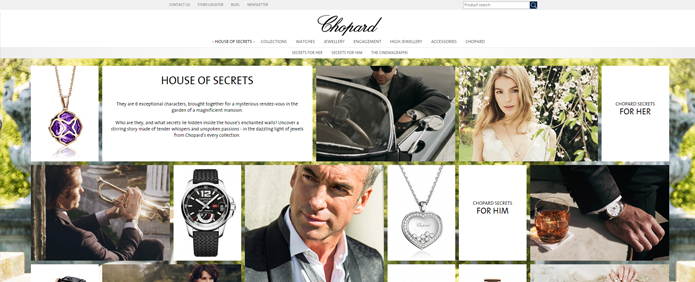
- ChopardJust like it deals with luxury brands that offer a complete collection of watches and jewellery, its website is classy and chic with brilliant use of images. Check out cool GIF images which added the dynamic touch to the flat design. Bravo!
-
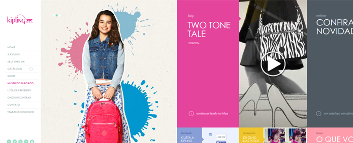
- KiplingSoothing colors of pastel shades, simple typography, bold images and horizontal scrolling makes it a perfect combination.
-
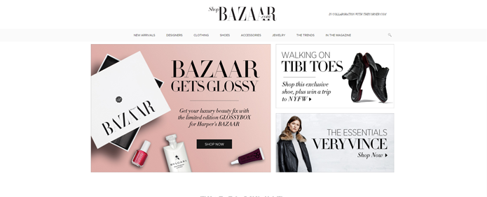
- ShopBazaar.comThe luxury fashion online store of Harper’s BAZAAR focused on monochrome flat UI. Very elegant!
-
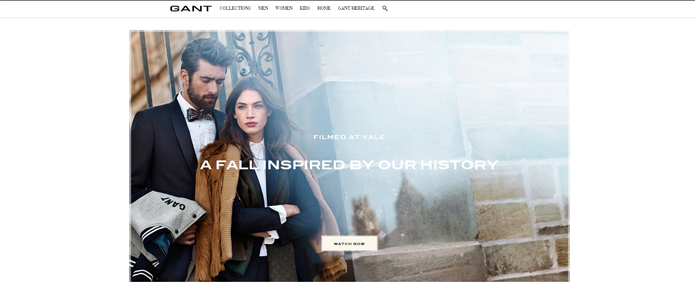
- GantAnother website with mostly black and white UI and clean display of product images with fully white background. It strikes out!
-
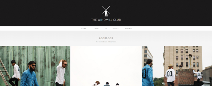
- The Windmill ClubMinimalistic design, big images and cool display of the sizechart for the products is what maked this stand out.
-
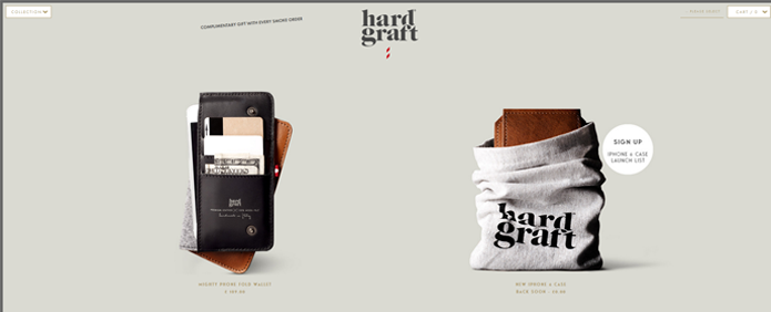
- Hard GraftThis website is as elegant as its products. Shows some excellent product photography and gives a delightful experience browsing the product gallery.
-
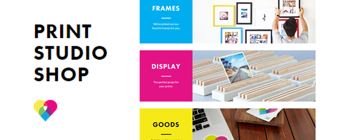
- Print Studio ShopTheir different sections with use of CMYK colors is doing justice to the main moto of their site.
-
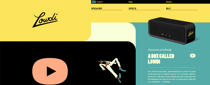
- LowdiThis website is something stunning, giving an energetic vibration with the bold use of colors and asymmetrical shapes.
-
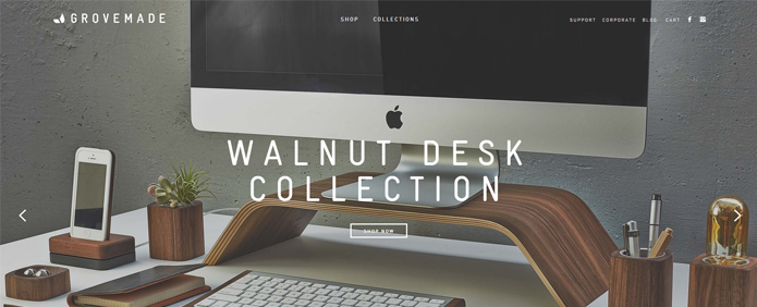
- GrovemadeThey sell wooden handcrafting goods. The site has that wooden touch with excellent product images.
-
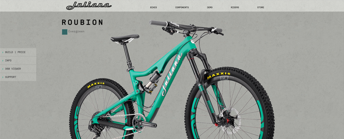
- Juliana BicyclesGorgeous flat design. Peppy and colorful. I just loved the design of the dropdown (from the header)
-
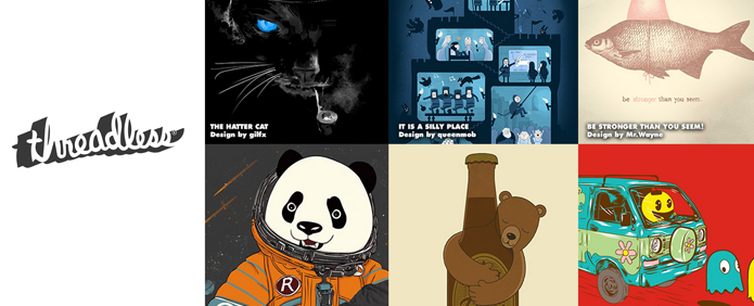
- ThreadlessOne of my very favourite websites with clean and responsive design
-
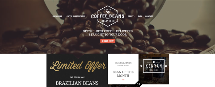
- CoffeeBeansDeliveredShades of brown, black and orage and the rich images which will surely make you drool.
-
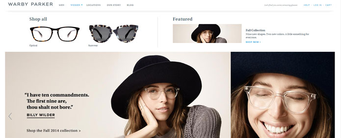
- Warby Parker The simple apporach and minimalist design is what makes the website stand out and look as stylish as the brand!
These are our picks for now. We’ll be back with more! Please comment below and share with us the ecommerce websites with flat design you like the most.
If you are an eCommerce merchant and looking to complete commerce sales processing through your ERP or CRM, we have the right solution for you – APPSeCONNECT, world’s easiest solution to integrate your ERP, eCommerce and CRM and help you grow your business.

You may also like:
Top eCommerce blogs of 2016
22 Tips to Grow Your Ecommerce Business
How to Use Twitter for Ecommerce Marketing


